Underoath
Underoath
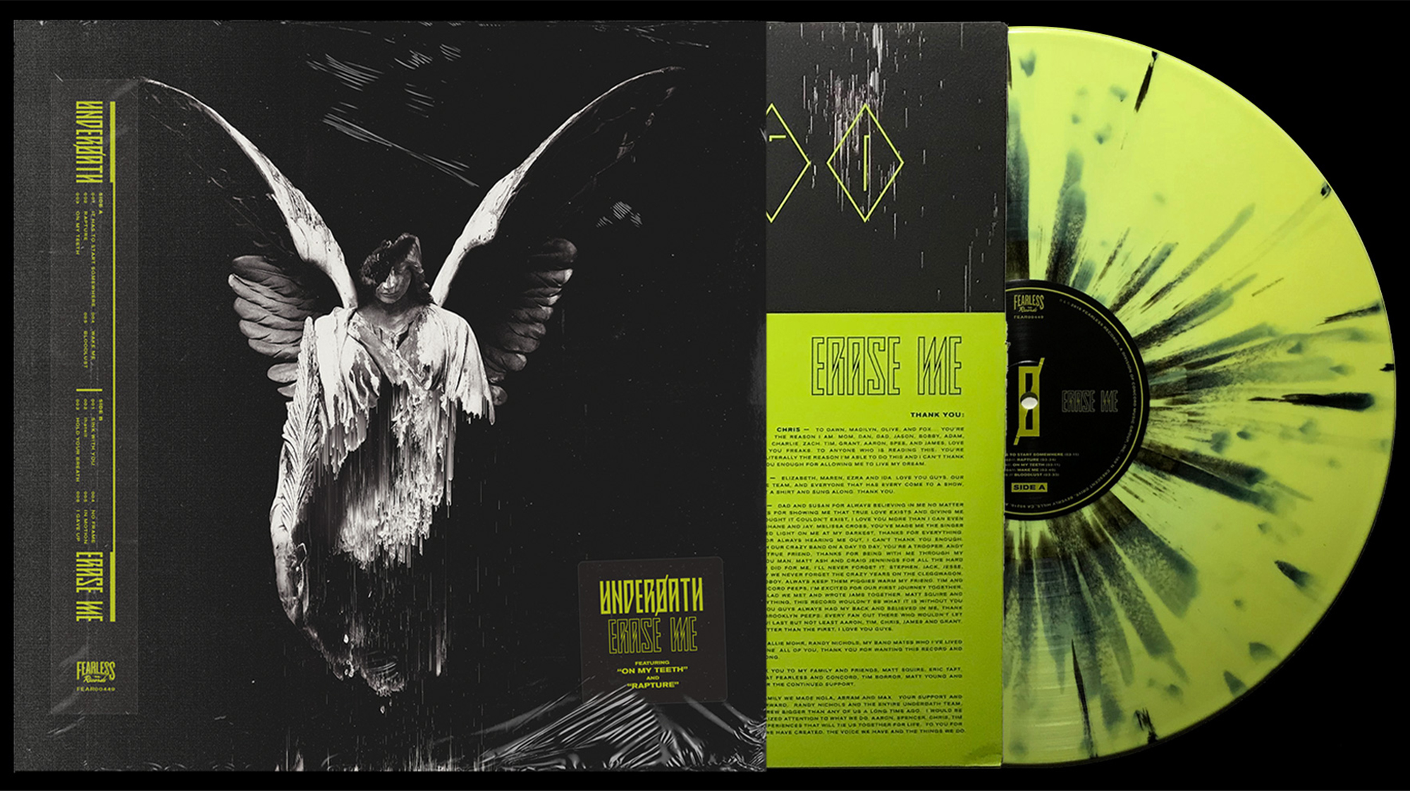
Erase Me
Erase Me
CREATIVE DIRECTION: BRANDON RIKE + JOEL COOK
ART DIRECTION & DESIGN: BRANDON RIKE
ALBUM LAYOUT: BRANDON RIKE
PHOTOGRAPHY: NICK FANCHER + DAN NEWMAN
—
LABEL: FEARLESS RECORDS
MANAGEMENT: RANDY NICHOLS


—
ERASE ME
—
The audacity to profess your true self is a virtue. Moreover, the transparency to outwardly proclaim a significant shift in the sentiment you once held so sacred, no matter the backlash, is courageous and compelling. Underoath re-emerges with Erase Me, the band’s eighth studio album, and their boldest statement to date, both musically and lyrically. A band once known for their outspoken faith, takes the same outspoken approach, only with the honesty of the doubt, anger, and disbelief associated with the aforementioned faith. Contradictions and collisions run rampant, as the narrative shifts from worship to contempt. If bold sentiment was ever a cornerstone of Underoath’s identity, Erase Me is ripping at the seams with the same brutal honesty, yet slightly evolved.
This shift is significant for a band like Underoath, and should not be ignored. While the narrative should not exploit the “good band gone bad” angle, the evolution should be honored and respected. In the same way as they always have, Underoath are unashamed to share their stance. In fact, Erase Me begins to feel more holy than their previous endeavors, and offers the listener the relief and acknowledgement of a strong faith in decay.
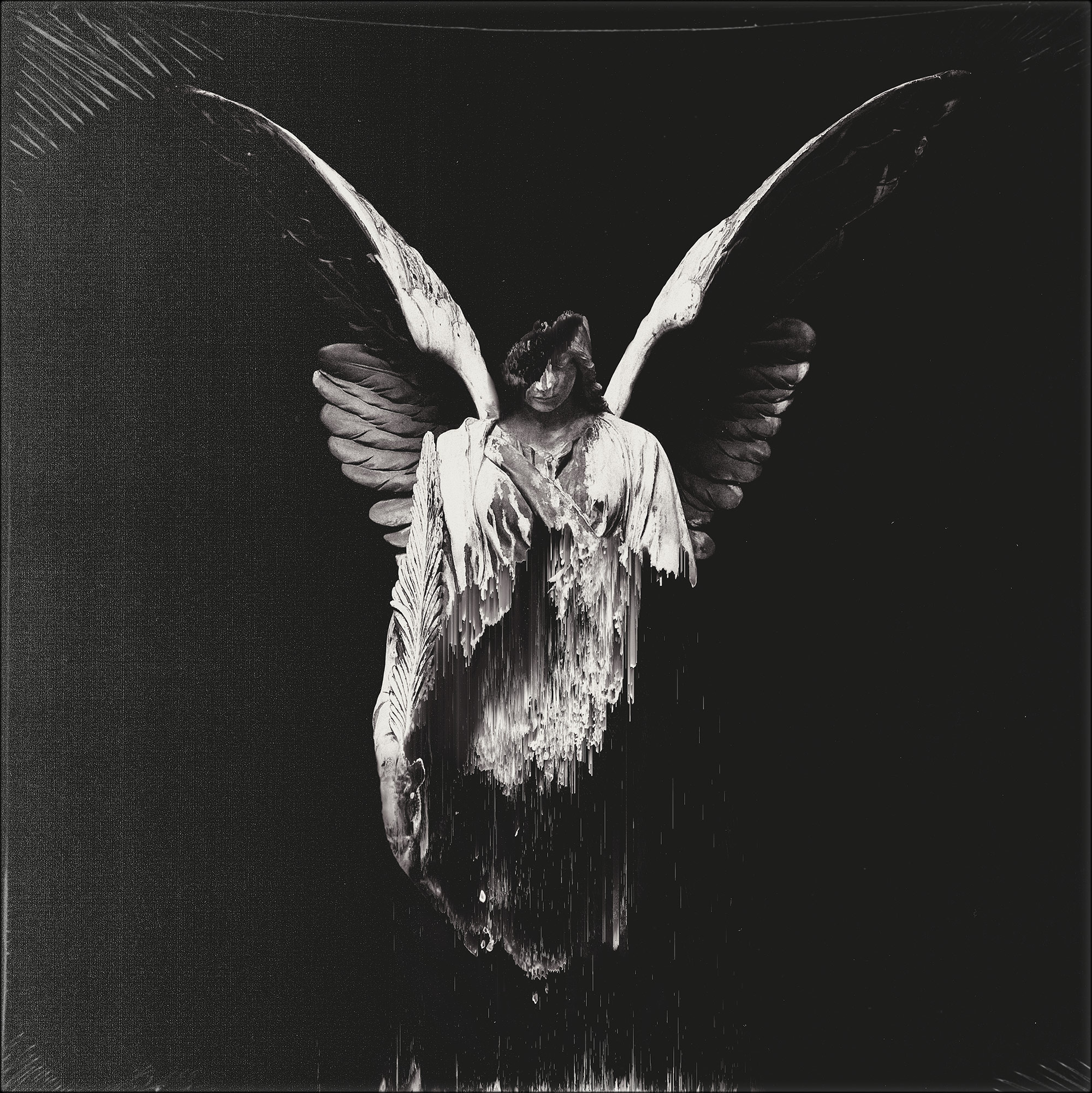
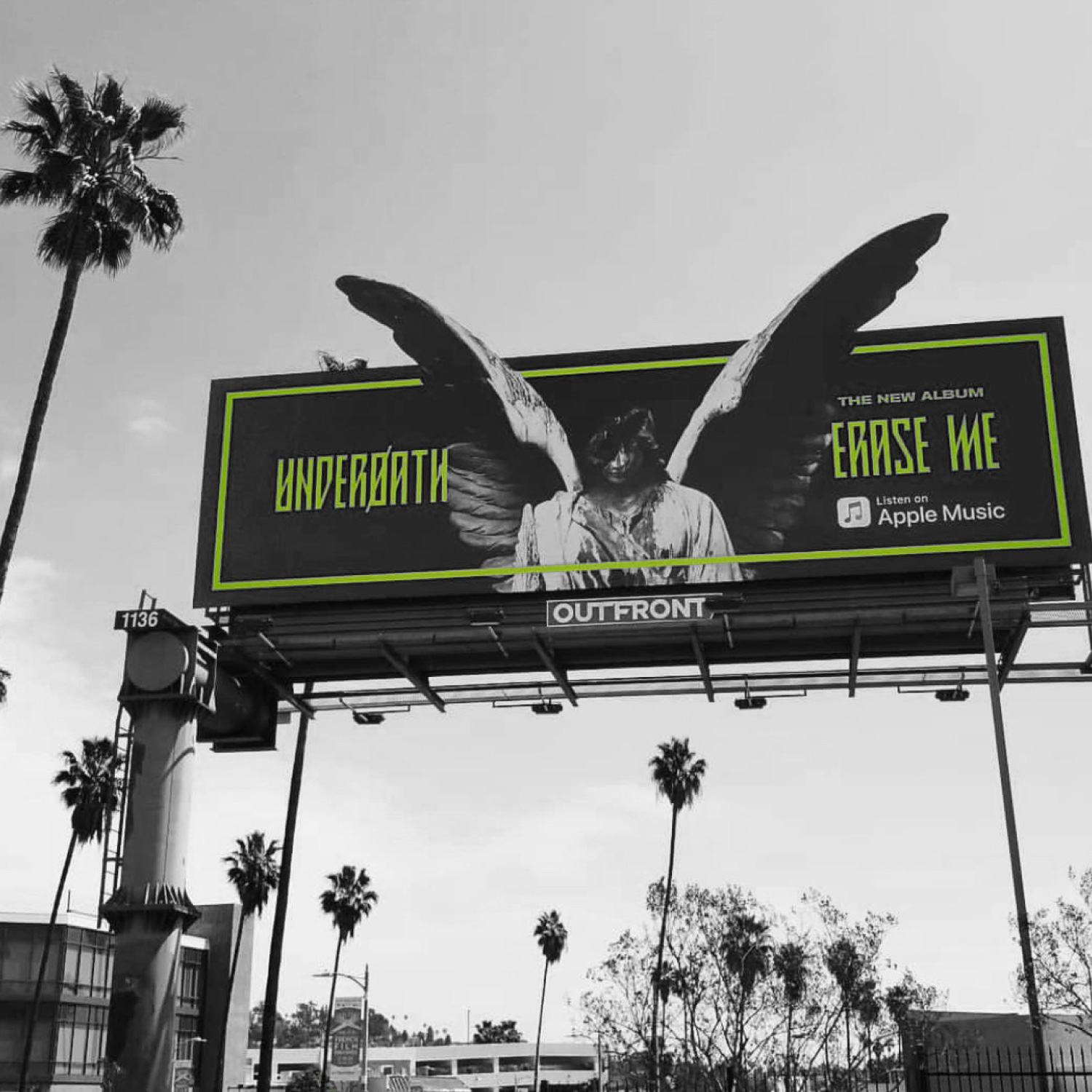
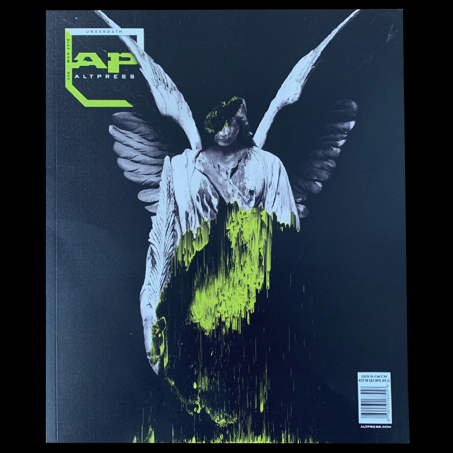
The narrative that we want to carry through the album cycle is the idea that the biblical and historical absolutes that we have relied on are now in decay, and have been deconstructed to reveal that these idols were not made of what we though they were, but yet a synthetic formation that aimed to capture our belief and dedication, yet lacked real substance. This idea is conveyed as a historical statute is corroded to reveal a digital core, one that misaligns with the historical significance of the idol. What we have worshipped has lacked true substance.
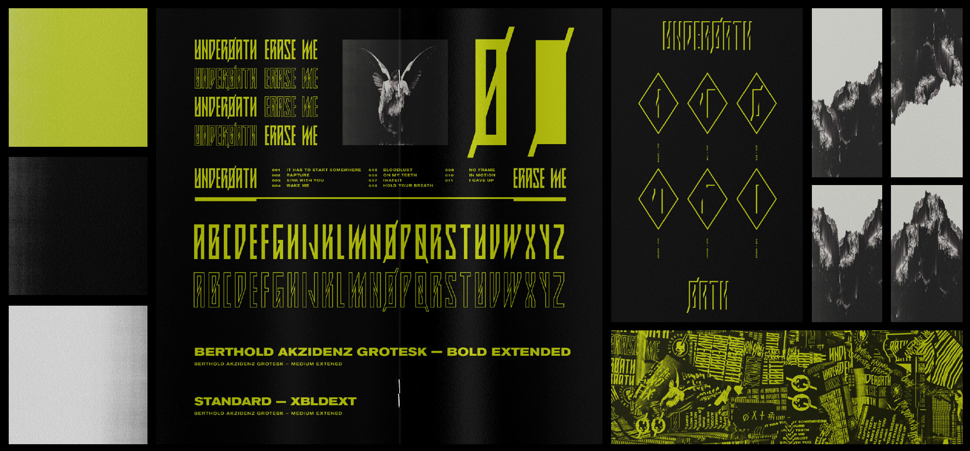
The ‘Idol in Decay’ becomes an element that can be carried throughout. Plaster busts of the band members can be deconstructed to either be erased, or revealed as synthesized. To contrast with this imagery, bold type and symbolism provide a toolbox of branding elements that can be spread across all mediums. The symbols will act as clues, and allow the fanbase something tangible to participate with, and to spark curiosity and discovery.
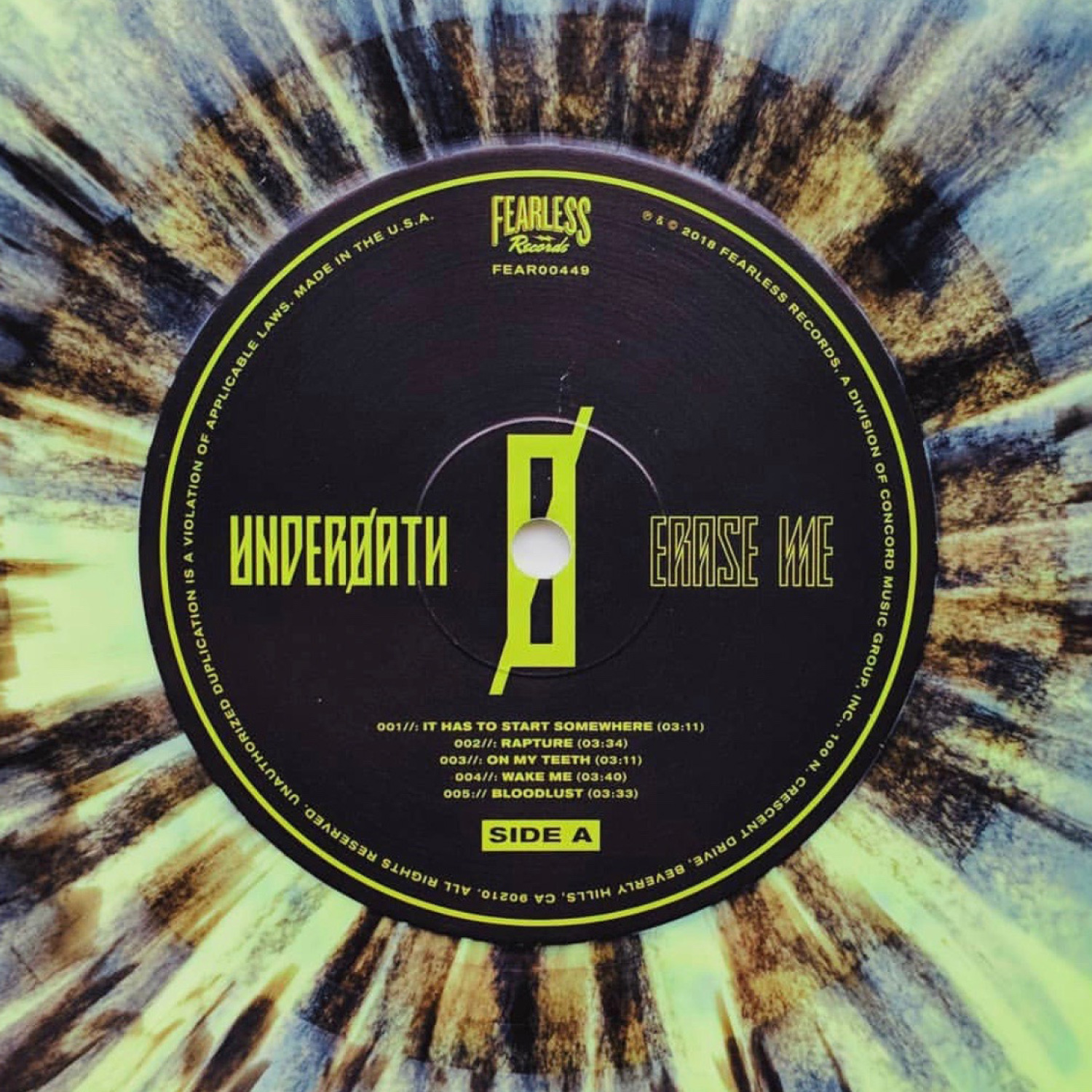
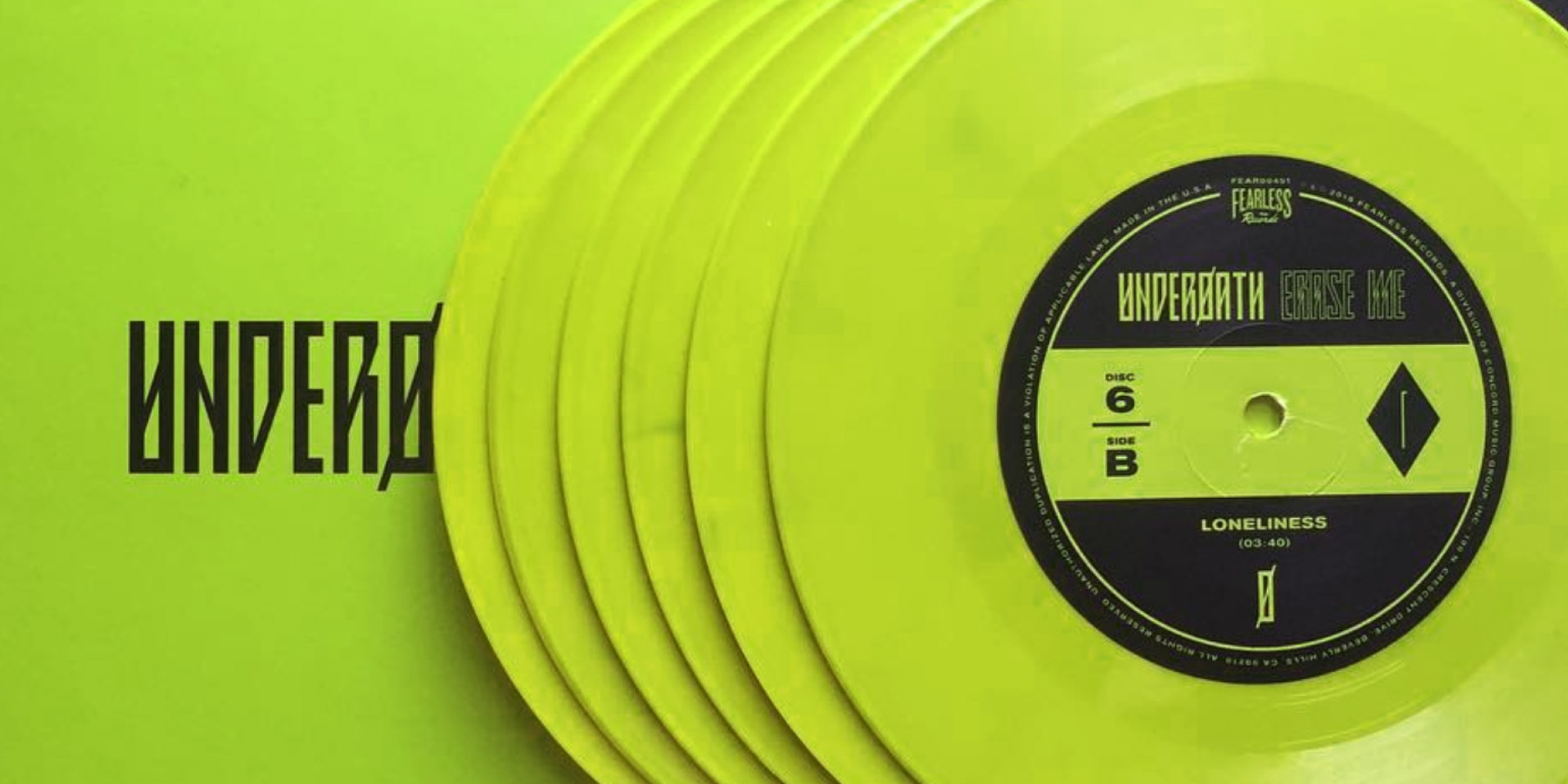
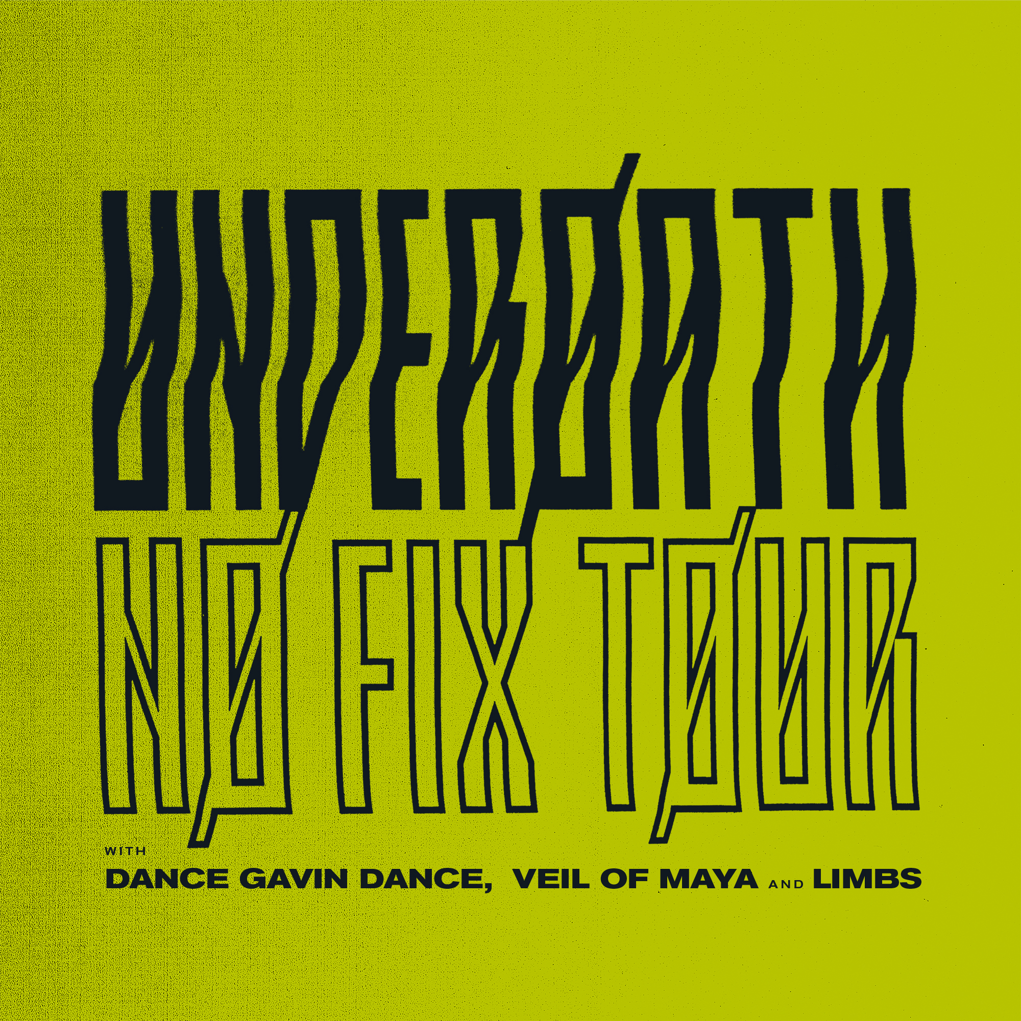
In addition to the imagery, typefaces, and symbolism is the stark commitment to a simplified color palette: Acid Green (Pantone 381) and no other colors. Black and White Imagery accompany this bold color to pronounce the brand with extreme clarity.
Underoath is one of the finest of this musical style. This brand story finally gives the band the honor and presence that they deserve, and lifts their image to that of legend and royalty of the genre.